Headers & Footers for dashboard cards
Some dashboard cards have support for header and footer widgets. These widgets fill up the whole available space in a card.
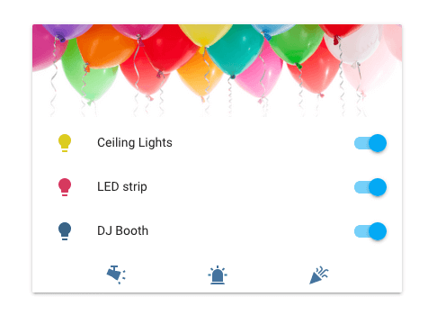
 Screenshot of an entities card with a picture header and buttons footer.
Header and footer can be used on the following cards:
Picture header & footer
Widget to show a picture as a header or a footer. A picture can have touch actions associated with it.
header:
  type: picture
  image: "https://www.home-assistant.io/images/dashboards/header-footer/balloons-header.png"
Configuration Variables
Alternative text for the image. This is necessary for users of assistive technology. The W3C images tutorial
Action taken on card tap. See action documentation.
Action taken on tap-and-hold. See action documentation.
Action taken on double tap. See action documentation.
Buttons header & footer
Widget to show entities as buttons in the header or footer.
footer:
  type: buttons
  entities:
    - script.launch_confetti
    - entity: script.swirl_lights
      icon: "mdi:track-light"
    - entity: script.run_siren
      icon: "mdi:alarm-light"
Configuration Variables
A list of entities to show. Each entry is either an entity ID or a map.
Override the entity icon. You can use any icon from Material Design Iconsmdi:, ie mdi:home.
Action taken on button tap. See action documentation.
Action taken on tap-and-hold. See action documentation.
Action taken on double tap. See action documentation.
Graph header & footer
Widget to show an entity in the sensor domain as a graph in the header or footer.
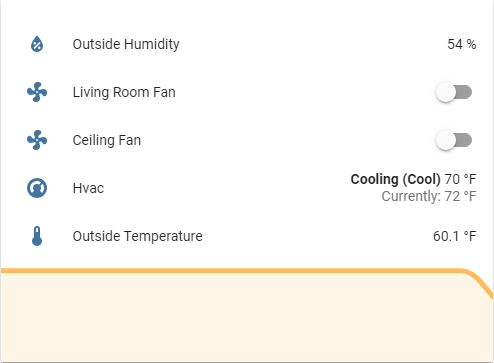
 Screenshot of an entities card with a graph footer.
footer:
  type: graph
  entity: sensor.outside_temperature
  hours_to_show: 24
  detail: 1
The hours_to_show option controls the time range of historical data shown in the graph. The amount of history available depends on the Recorder’s purge_keep_days setting. By default, the Recorder purges data older than 10 days. See the Recorder integration documentation for more information.