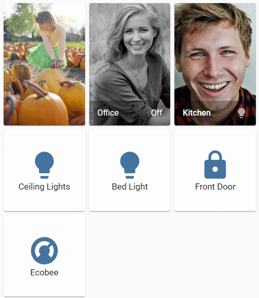
Grid card
The grid card allows you to show multiple cards in a grid. It will first fill the columns, automatically adding new rows as needed.
 Screenshot of the grid card.
To add the grid card to your user interface:
- In the top right of the screen, select the edit
button. - If this is your first time editing a dashboard, the Edit dashboard dialog appears.
- By editing the dashboard, you are taking over control of this dashboard.
- This means that it is no longer automatically updated when new dashboard elements become available.
- Once you’ve taken control, you can’t get this specific dashboard back to update automatically. However, you can create a new default dashboard.
- To continue, in the dialog, select the three dots
menu, then select Take control.
- If this is your first time editing a dashboard, the Edit dashboard dialog appears.
- Add a card and customize actions and features to your dashboard.
All options for this card can be configured via the user interface.
YAML configuration
The following YAML options are available when you use YAML mode or just prefer to use YAML in the code editor in the UI.
Examples
Basic example:
type: grid
cards:
  - type: picture-entity
    entity: camera.demo_camera
    show_info: false
  - type: entities
    entities:
      - binary_sensor.movement_backyard
Defining columns and disabling the square option:
type: grid
title: Backyard
columns: 2
square: false
cards:
  - type: picture-entity
    entity: group.all_lights
    image: /local/house.png
  - type: horizontal-stack
    cards:
      - type: picture-entity
        entity: light.ceiling_lights
        image: /local/bed_1.png
      - type: picture-entity
        entity: light.bed_light
        image: /local/bed_2.png