Blog
Community Highlights: 16th edition
What did you think of the release last Wednesday? A lot of cool things have been added! But there were also a lot of great projects shared this week from the community and we have selected the best for you. So here’s the 16th edition of the Home Assistant Community Highlights!
Do you want to share something for the next edition? Information on how to share.
./Klaas
Blueprint of the week
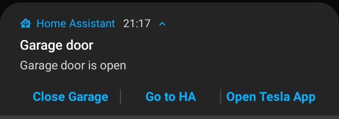
You’re leaving home and oh dear! It turns out that one of your lights is on 💡 What if you then receive a notification with an option to switch off the light, without having to open the Home Assistant app first?
With the blueprint from vorion you can easily get started to create your own actionable notifications, give it a try. Read more about it on the community forum or install this automation in your instance with a click on the my button!
Google Home
Long ago it was possible to read the alarms and timers from your Google Home in Home Assistant, due to a change in the API this was unfortunately no longer possible.
But thanks to a new custom integration
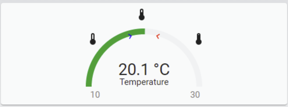
Tempometer Gauge Card
Are you looking for a card to spice up your existing gauge card?
Then try the tempometer gauge card
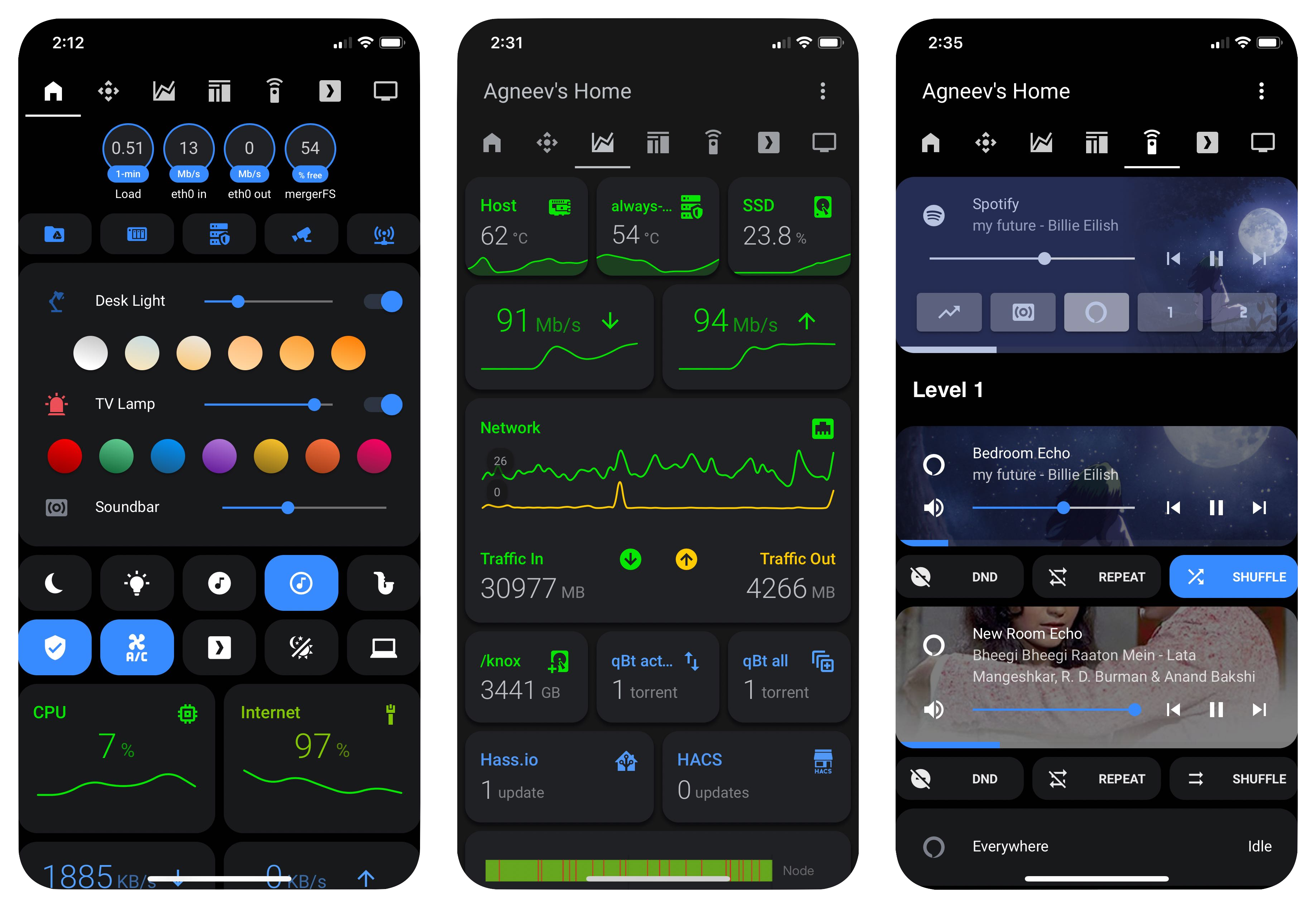
Lovelace Dashboard
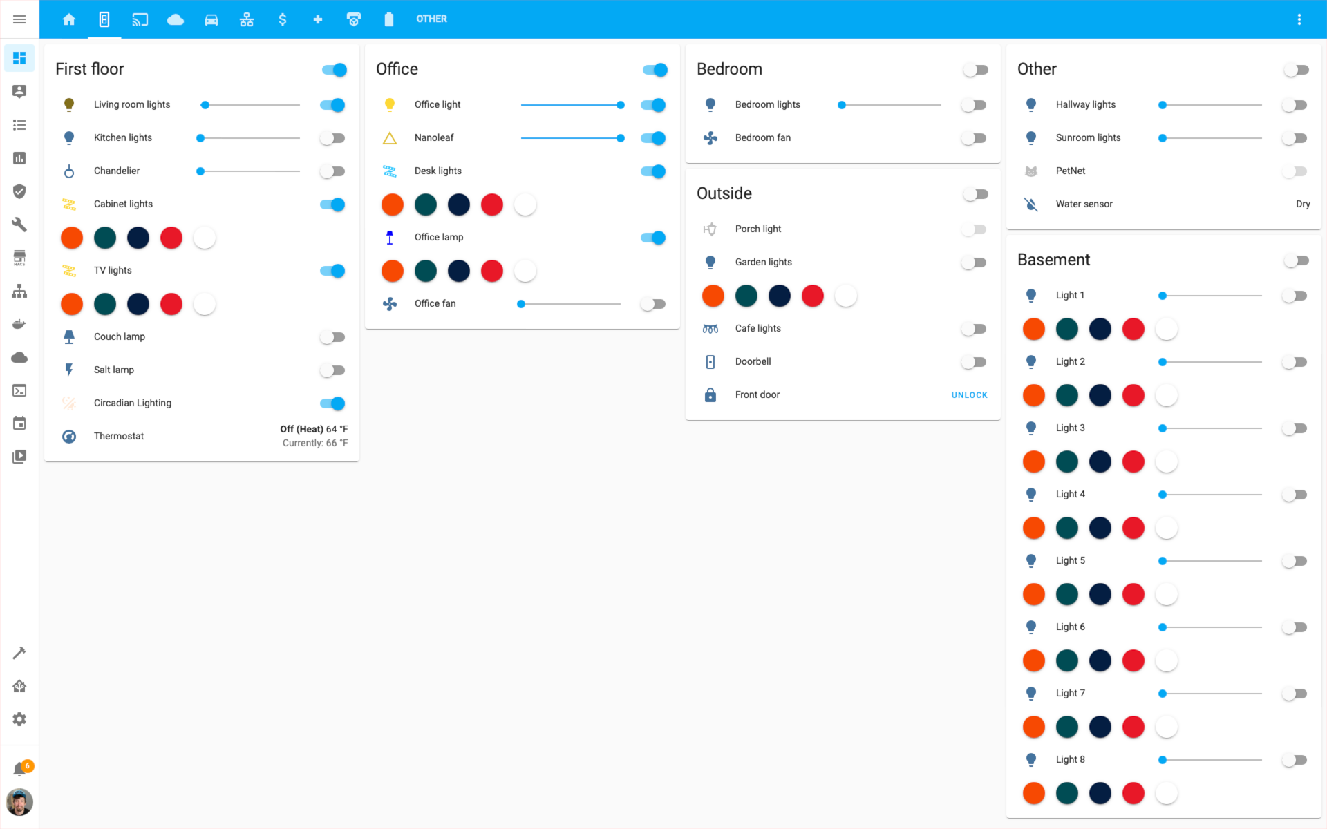
This week also a Lovelace dashboard and this time that of agneevX
You can find all his code in this repository
Got a tip for the next edition?
Have you seen (or made) something awesome, interesting, unique, amazing, inspirational, unusual or funny, using Home Assistant?
Click here to send us your Community Highlight suggestion.
Also, don’t forget to share your creations with us via Social Media:
- Tweet it! Be sure to mention @home_assistant
- Share it on our Facebook group
- Post it to our subreddit
- Tag @homeassistant
on Instagram - Or via chat, drop us a line in the #lounge at Discord
See you next edition!
Home Assistant Companion Android App April 2021 Release
Hey Everyone! It’s time for the April 2021 Android release. Last month we wrote that we would be aligning our releases closer to Home Assistant core so here we are! Another month went by and the Android app has started to see more contributors coming along. Hopefully, you will join us next month as we can always use more contributors to move forward faster.
In-App Log Viewer
This release has a new feature that will make viewing and sharing the logs MUCH easier. Some of you may recall the large number of steps needed to get Android logs when you open issues. This usually involved installing Android Studio
We’ve added a new option to the App Configuration called “Show and Share Logs”. It will show all the logs from our app, including debug logs to help troubleshoot issues such as when the location does not update or if the app is using the correct URL. You are not only able to view this log but also share and select from it so you can copy the logs to a GitHub issue
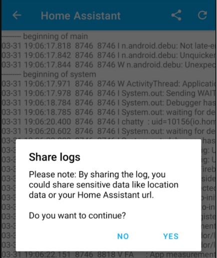 Screenshot of In-App Log Viewer
Settings Improvements
We have had several improvements made to the overall design of the App Configuration pages to make better use of the space and add some neat features. First and foremost, every setting screen now has a new help icon taking you to the proper place in the documentation like location settings or even notifications. Just look for the new help icon at the top right-hand corner, if the page does not offer enough information.
As of this release the app now has a total of 71 sensors, given your device supports them all your number may be less. That is a lot of sensors and we don’t expect a lot of users to actually use them all. We have added 2 new features to make this page easier to navigate. You can now filter by showing only the enabled sensors to get rid of the sensors you don’t want to use, if you have all sensors enabled don’t expect to see this filter. You can also perform a search against the list of sensors to find one quickly and manage it.
Notification History now lets you search by the message that was sent to the device. Searching will bypass the filter options we have, which limits the view to the last 100 notifications. Filtering and delete options have been moved to the top right-hand corner to make better use of the space.
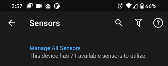 Screenshot of Sensor Search & Filter.
Shortcuts
Sometimes when you open the app you may already know exactly where you want to go. You may find yourself on the same view often to see your cameras or give the nursery a quick look to make sure things are ok. You may even want to quickly see the history of an entity like when the door was last opened. In this release, we have introduced Android Shortcuts
There are a few different shortcut types and in the nature of Home Assistant, we have opted not to add static shortcuts because they are static! We support dynamic shortcuts which will show up under the app long-press menu. Once you create a shortcut, you will be able to drag it onto your home screen. There is also support for pinned shortcuts that can be added automatically to your home screen without needing to drag the icon, given your device and launcher support pinned shortcuts. Check out the documentation for more details including known limitations.
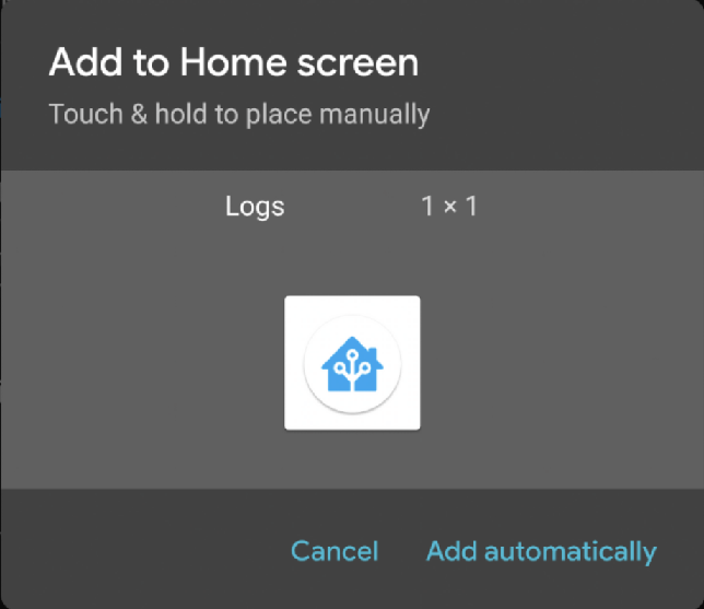 Screenshot of Shortcuts
Other Changes
Here is a list of the other changes you may notice:
- Battery Temperature Sensor
- Notification command to turn on the screen
- BLE Transmitter has a new setting to enable/disable the transmitter so the sensor can remain enabled. This new setting will correspond to the existing notification command.
- High Accuracy mode has a new zone-based automation feature allowing you to trigger this mode faster. See the documentation for more details.
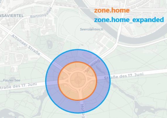 Screenshot of High Accuracy Zoning.
- Long-pressing an entity in Android’s Power Menu will now take you directly to the entity instead of the home page.
- Covers that support setting the position are also supported in Android’s Power Menu.
- Lots of fixes and improvements in all other areas of the app.
Big thank you to everyone involved. Please keep those bug reports and feature requests coming!
Changelog
2021.4: For our advanced users ❤️
Survived April fools day? I assure you, this April release is no joke!
This release is dedicated to our more advanced user base, as it is packed with some really advanced features and enhancements our more experienced users will love. Ready to debug your automations? Yeah…
Not that advanced of a user? I’m sure there is something in here for you to look forward to as well.
Oh, by the way, have you heard the news of ESPHome joining the Home Assistant family? If not, you should definitely read the blog post announcing it!
Enjoy the release!
../Frenck
- Database upgrades, please be patient
- Automation debugging
- Home Assistant Analytics
- Warnings for undefined variables in Templates
- Filtering automations, scripts and scenes
- Z-Wave JS update
- Trigger-based template sensors
- UI selectors for script fields
- Other noteworthy changes
- New Integrations
- New Platforms
- Integrations now available to set up from the UI
- Release 2021.4.1 - April 8
- Release 2021.4.2 - April 9
- Release 2021.4.3 - April 10
- Release 2021.4.4 - April 13
- Release 2021.4.5 - April 16
- Release 2021.4.6 - April 19
- If you need help…
- Backward-incompatible changes
- Farewell to the following
- All changes
Database upgrades, please be patient
This release contains database migrations, meaning that the format of how your history is stored is changing. This migration is automatically performed after upgrading and takes a bit of time. The time it takes depends on how much history you have stored and how fast your system is.
Please be patient when upgrading to this release.
Automation debugging
Wait, why didn’t that light turn on? Why isn’t the thermostat adjusted? Why is this automation not working? What is going on here?! This is a haunted house!?!
Sounds familiar? I’m sure we all had these moments, but are you ready for this? We can now debug automations!
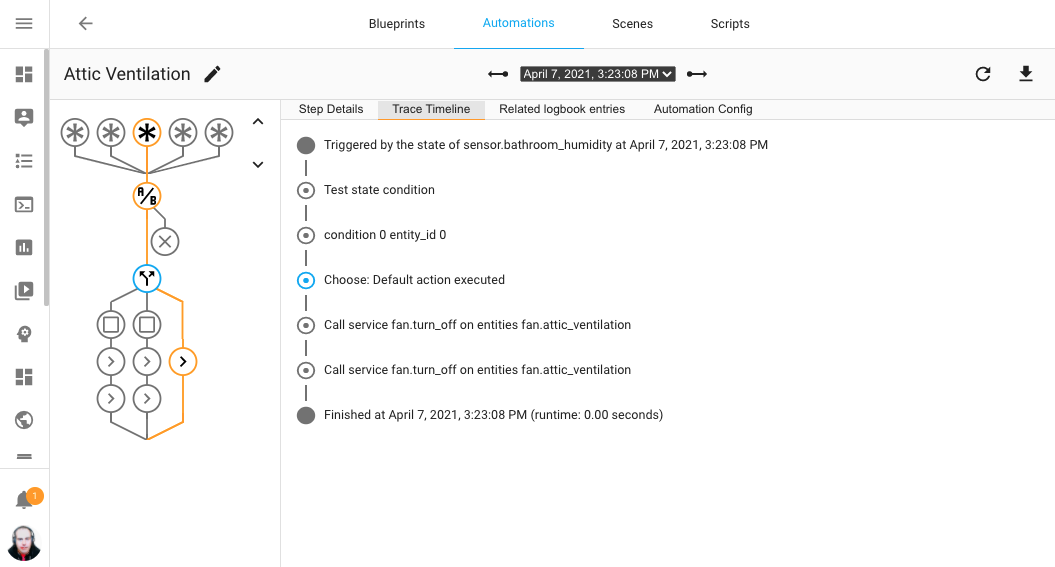 Screenshot showing the automation trace of a previously ran automation.
The above screenshot shows a previous run of an automation. The automation is displayed using an interactive graph, which highlights which path the automation took. Each node in the graph can be clicked to view the details on what happened with the automation during that specific step. It traces the complete run of an automation run.
If an automation didn’t run as it should, this will allow you to debug and understand why it ran the way it did.
This extremely advanced and super useful feature is thanks to the hard work
of @emontnemery
Additionally, a special thanks to all the (beta) testers that helped testing this feature and those who provided trace samples that helped to squash bugs!
Got questions about this feature? Want to see it in action? Be sure to tune in to the 2021.4 release party stream later today!
Home Assistant Analytics
Now don’t be scared by the title!
Today we introduce: Home Assistant Analytics. Opt-in, privacy-aware, public and open source. Just as it all should be for our project.
@ludeeus
Not open enough for you? We are publishing the result for everybody to see:
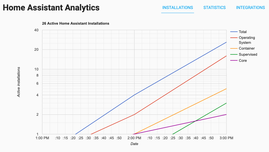 Screenshot of the Home Assistant Analytics website.
Well, maybe you want to view the public result yourself:
https://analytics.home-assistant.io
So why do we do this? Well, it helps the project and all contributors to see things like: Most used integrations. This can significantly help with improving project priorities. It also helps to convince manufacturers to work with Home Assistant, add local control and privacy-focused features.
“But the updater did this already, right?” Yes, well, the updater has actually been broken. So while we had some data, it was barely usable (actually not useable at all). Instead of fixing the updater, we now have a better solution that better matches our project goals. The updater still exists; it now just does one single thing: showing if an update is available.
Want to help the project out? Please enable Home Assistant Analytics. We would be very grateful!
You can find the settings in the general configuration options, or click the My Home Assistant button below to go directly to it. (Only visible to owner users)
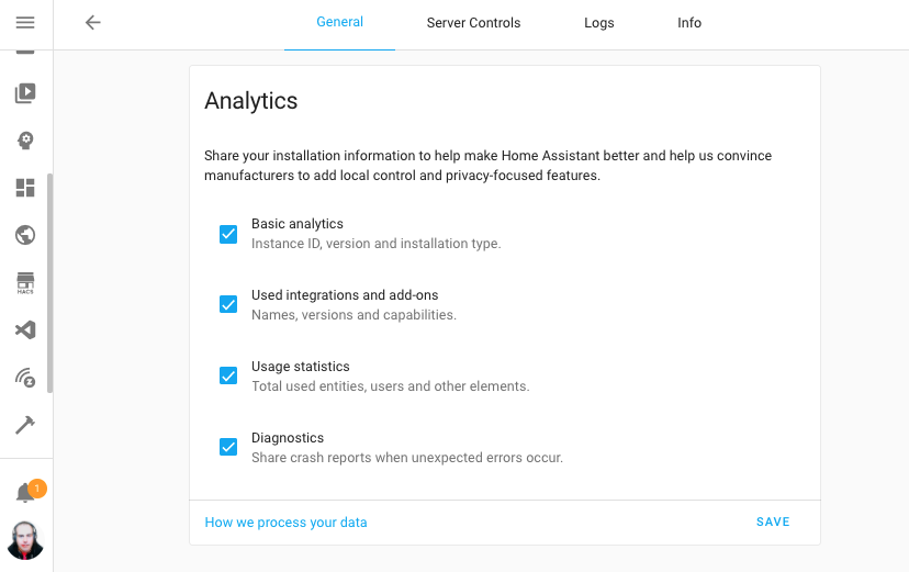 Screenshot of the Home Assistant Analytics options, you control the amount of
data you share.
For more information on how this all works and what data is shared, check out our documentation.
Thanks for sharing already! ❤️
Warnings for undefined variables in Templates
This feature is really cool. While technically a small improvement, it is a change that can impact you (as in “breaking”), but also, will greatly help you!
So imaging this little template: {{ my_variable }}
Previously, if my_variable would not exist in the template or system as a
variable, Home Assistant would just ignore it and skip over it.
While this can be convenient, it can become problematic when it was misspelled
or referring to a variable that doesn’t exist at all. For example, if you
would have mistyped it: {{ my_varaible }}, you would
never know something is wrong, unless you spotted it.
As of today, Home Assistant will tell you this, using a warning in the logs!
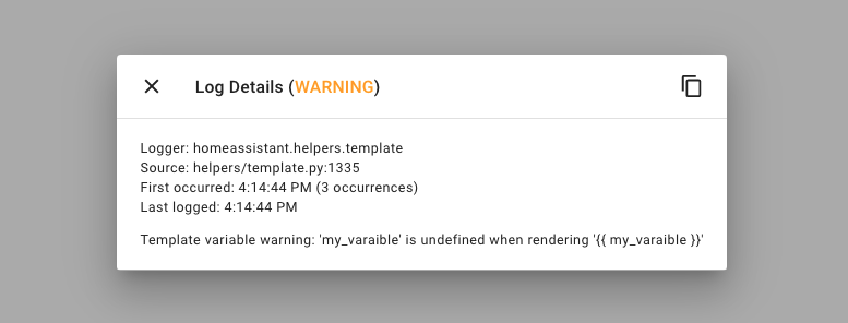 Screenshot of undefined variable warning log.
This helps to find templates that behave unexpectedly because the variable you thought was there, isn’t. It is quite possible you get a bunch of warnings after upgrading to this release. Fixing those warnings, really helps to improve your setup.
So, what if a variable isn’t always there, but I still want to use it? Well,
you can give it a default, for example:
{{ my_variable | default }}. Or even a default value
(10 in this example): {{ my_variable | default(10) }}.
Please note that these are just warnings for now. We plan to replace the warning with an error as of Home Assistant 2021.10 (in October).
Filtering automations, scripts and scenes
Categorizing automations, is definitely one of the most requested things in our history. This became clear again during last year’s month of what the heck and various issues/discussions/feature requests.
Suggestions for labels, folders, and many more have been created. However, we already have some great categorizing features in Home Assistant itself:
Devices, Areas & Entities.
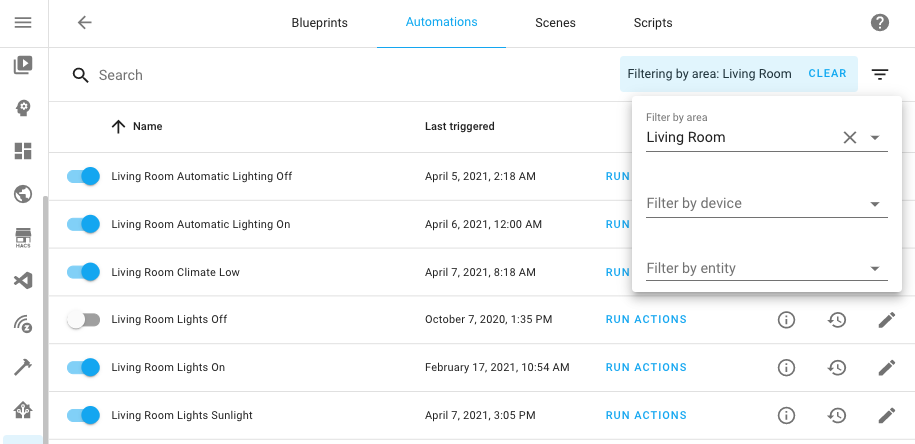 Screenshot of filtering automations by living room area.
As of today, you can filter your automations, scripts and scenes by area, device or entity. For automations and scripts, it goes one step further; it magically finds those that affect the area, device or entity being filtered.
So, you can now look at the automations affecting your living room area (even if those automations itself are not in the living room area) and also filter the automation list with just the ones that touch your thermostat.
Z-Wave JS update
So before we talk about The nice new things in Z-Wave JS, there are breaking changes in this release for the Z-Wave JS integration that could affect your existing automations. Be sure to read the backward-incompatible changes section for more info.
Alright, now the fun stuff! You can now configure each Z-Wave device straight from within Home Assistant. When you view a device in the Home Assistant frontend, you can click on “CONFIGURE DEVICE” button that is shown on each device page. This allows you to manage and adjust device (node) specific configuration parameters for the selected device.
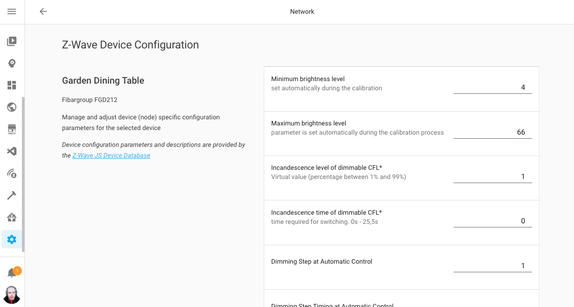 Screenshot of configuring a Z-Wave device from within Home Assistant.
Furthermore two new, advanced, services are introduced:
-
zwave_js.set_value, a service that is capable of setting a value on a Z-Wave device directly, bypassing Home Assistant. -
zwave_js.bulk_set_partial_config_parameters, a service that will allow you to set configuration parameters in bulk.
Trigger-based template sensors
This release adds initial support for a pretty advanced new, helpful feature. Template sensors, that are updated based on triggers and the data that comes with it.
Whenever the trigger fires, the template sensor will re-render and it will have access to the trigger data in the templates. This feature is a great way to create data based on webhook data, or have sensors be updated based on a time schedule.
See, for example, these two template sensors that update based on a single webhook trigger using data pushed into the webhook:
# Example configuration entry
template:
  - trigger:
      - platform: webhook
        webhook_id: my-super-secret-webhook-id
    sensor:
      - name: "Webhook Temperature"
        state: "{{ trigger.json.temperature }}"
      - name: "Webhook Humidity"
        state: "{{ trigger.json.humidity }}"
You can test this trigger entity with the following CURL command:
curl --header "Content-Type: application/json" \
  --request POST \
  --data '{"temperature": 5, "humidity": 34}' \
  http://homeassistant.local:8123/api/webhook/my-super-secret-webhook-id
It is not just webhooks! Any trigger that you can use in automations, can be used to update these types of template sensors.
For this release, it only works for sensors; other platforms are not supported yet.
Please note: that these new template sensors are configured under the template:
key in the configuration and is using a new configuration format and keys.
For more information, see the documentation.
UI selectors for script fields
You can now use UI Selectors for you scripts field parameters. This brings the same UI capabilities that Blueprint have to scripts. This allow for creating advanced scripts that you can later easily reuse in your UI (even in UI automation).
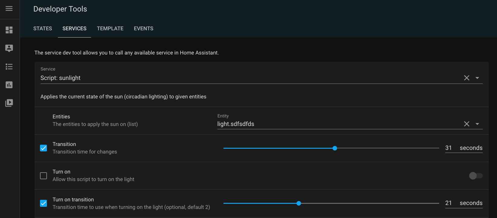 Screenshot of scripts using selects in its fields.
For more details on these new field configuration options, see the scripts documentation
Other noteworthy changes
There is much more juice in this release; here are some of the other noteworthy changes this release:
- The Supervisor is now also in the integrations dashboard, and provides entities
for all kinds of things! These entities are disabled by default, so head
over to the integration and see if there anything in there you could use.
Thanks @raman325
! - The develo Home Control (@Shutgun
), Apple TV (@bdraco ), August (@bdraco ) and MQTT (@RadekHvizdos ) integrations can now suggest areas. - You can now configure additional Google Cast devices by IP address via the
integrations options. This is helpful in case of mDNS issues.
Thanks @emontnemery
! -
@joshmcrty
added support for selecting the number formatting you like on your profile! Awesome work!
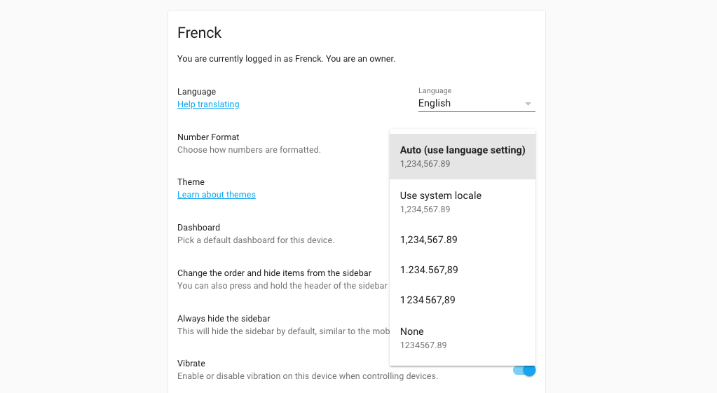 Screenshot of selecting the number format you prefer.
-
@marvin-w
added support for unique IDs to KNX entities. So, as a KNX user you can now tweak your entities in the frontend and group them into areas! - HomeKit now supports CO/CO2 device classes, thanks to @iMicknl
! -
@robertdelpeut
added monthly and yearly totals to the DSMR sensor, thanks! - Hyperion users can now hide certain effects from the UI using integration
options. Thanks, @dermotduffy
! - Got that one message in your logs that you don’t care about? @jshufro
added support for filtering log messages using regular expression! - The Plex integration now provides library count sensors! These
are disabled by default by can be enabled if you like that. Thanks, @jjlawren
. - The Quickbar had an update from @donkawechico
! So press those C & E keys on you keyboard to see those beautiful new labels.
New Integrations
We welcome the following new integrations this release:
-
Analytics, added by @ludeeus
-
Legrand Home+ Control, added by @chemaaa
-
Pentair ScreenLogic, added by @dieselrabbit
New Platforms
The following integration got support for a new platform:
-
Gogogate2 and iSmartGate provides battery sensors for wiresless door sensors, added by @emontnemery
-
Panasonic Viera has now support for remotes, added by @joogps
-
Philips TV now has support for remotes, added by @elupus
-
Rheem EcoNet Products now have support for climate entities, added by @w1ll1am23
. -
Supervisor integration now has entities and services for things like versions and pending updates, added by @raman325
-
Tado now has weather support, added by @Noltari
Integrations now available to set up from the UI
The following integrations are now available via the Home Assistant UI:
-
Xiaomi Miio, fans, sensors and lights, done by @starkillerOG
-
Hive, done by @KJonline
-
Verisure, done by @frenck
Release 2021.4.1 - April 8
- Check all endpoints for zwave_js.climate fan mode and operating state (@raman325
- #48800 ) (zwave_js docs) - Add missing super call in Verisure Camera entity (@JohNan
- #48812 ) (verisure docs) - Fix iCloud extra attributes (@nzapponi
- #48815 ) (icloud docs) - Replace redacted stream recorder credentials with ‘****’ (@emontnemery
- #48832 ) (stream docs) - Fix mysensor cover closed state (@MartinHjelmare
- #48833 ) (mysensors docs) - Validate supported_color_modes for MQTT JSON light (@emontnemery
- #48836 ) (light docs) (mqtt docs) - Bump speedtest-cli to 2.1.3 (@spacegaier
- #48861 ) (speedtestdotnet docs) - Correct wrong x in frontend manifest (@bramkragten
- #48865 ) (frontend docs) - Fix motion_blinds gateway signal strength sensor (@starkillerOG
- #48866 ) (motion_blinds docs) - Fix possibly missing changed_by in Verisure Alarm (@frenck
- #48867 ) (verisure docs) - Fix optional data payload in Prowl messaging service (@frenck
- #48868 ) (prowl docs) - Update frontend to 20210407.2 (@bramkragten
- #48888 ) (frontend docs)
Release 2021.4.2 - April 9
- Account for openweathermap ‘dew_point’ not always being present (@hanskroner
- #48826 ) (openweathermap docs) - Catch expected errors and log them in rituals perfume genie (@milanmeu
- #48870 ) (rituals_perfume_genie docs) - Extend media source URL expiry to 24h (@emontnemery
- #48912 ) (media_source docs) - Bump pykodi to 0.2.4 (@cgtobi
- #48913 ) (kodi docs) - Handle exceptions when looking for new version (@ludeeus
- #48922 ) (version docs) - Change discovery timeout from 10 to 60 (@ludeeus
- #48924 ) (hassio docs) - Fix “notify.events” trim() issue + add initial tests (@spacegaier
- #48928 ) (notify_events docs) - Bump pykodi to 0.2.5 (@cgtobi
- #48930 ) (kodi docs) - Bump ZHA quirks library (@dmulcahey
- #48931 ) (zha docs) - Extend Google Cast media source URL expiry to 24h (@Ph-Wagner
- #48937 ) (cast docs) - Fix Plex live TV handling (@jjlawren
- #48953 ) (plex docs)
Release 2021.4.3 - April 10
- Add TTS engines in config.components (@ludeeus
- #48939 ) (tts docs) - Implement percentage_step and preset_mode is not not speed fix for MQTT fan (@jbouwh
- #48951 ) (mqtt docs) - Bump devolo Home Control to support old websocket-client versions again (@Shutgun
- #48960 ) (devolo_home_control docs) - Fix config forwarding (@balloob
- #48967 ) (template docs) - Prevent ping id allocation conflict with device_tracker (@bdraco
- #48969 ) (ping docs) - Fix Shelly button device triggers (@thecode
- #48974 ) (shelly docs) - Update python-smarttub to 0.0.23 (@mdz
- #48978 ) (smarttub docs)
Release 2021.4.4 - April 13
- Move cast config flow tests to test_config_flow (@emontnemery
- #48362 ) (cast docs) - Bump nexia to 0.9.6 (@bdraco
- #48982 ) (nexia docs) - Set Lyric hold time to use local time instead of utc (@timmo001
- #48994 ) (lyric docs) - Fix Shelly brightness offset (@thecode
- #49007 ) (shelly docs) - Bump ha-philipsjs to 2.7.0 (@elupus
- #49008 ) (philips_js docs) - Fix use search instead of match to filter logs (@frenck
- #49017 ) (logger docs) - Resolve potential roku setup memory leaks (@ctalkington
- #49025 ) (roku docs) - Bump aiohomekit to 0.2.61 (@bdraco
- #49044 ) (homekit_controller docs) - Fix cast options flow overwriting data (@emontnemery
- #49051 ) (cast docs) - Quote media_source paths (@emontnemery
- #49054 ) (http docs) - mqtt fan percentage to speed_range and received speed_state fix (@jbouwh
- #49060 ) (mqtt docs) - Catch unknown equipment values (@dieselrabbit
- #49073 ) (screenlogic docs) - Downgrade logger message about homekit id missing (@bdraco
- #49079 ) (homekit_controller docs) - Upgrade maxcube-api to 0.4.2 (@unaiur
- #49106 ) (maxcube docs) - Check all endpoints for zwave_js.climate hvac_action (@jjlawren
- #49115 ) (zwave_js docs)
Release 2021.4.5 - April 16
- Bump aiodiscover to 1.3.4 (@bdraco
- #49142 ) (dhcp docs) - Fix setting up remotes that lack a supported features list in homekit (@bdraco
- #49152 ) (homekit docs) - Don’t receive homeassistant_* events from MQTT eventstream (@emontnemery
- #49158 ) (mqtt_eventstream docs) - Set deprecated supported_features for MQTT JSON light (@emontnemery
- #49167 ) (light docs) (mqtt docs) - Upgrade spotipy to 2.18.0 (@frenck
- #49220 ) (spotify docs) - Fix race when restarting script (@emontnemery
- #49247 ) - Fix mysensors sensor protocol version check (@MartinHjelmare
- #49257 ) (mysensors docs) - Fix Coronavirus integration robustness (@frenck
- #49287 ) (coronavirus docs) - Mark camera as a base platform (@ludeeus
- #49297 )
Release 2021.4.6 - April 19
- Apply Precision/Scale/Offset to struct in modbus sensor (@janiversen
- #48544 ) (modbus docs) - Upgrade pyMetno to 0.8.2 (@Danielhiversen
- #49308 ) (met docs) (norway_air docs) - Fix exception in roomba discovery when the device does not respond on the first try (@bdraco
- #49360 ) (roomba docs) - Fix deadlock when restarting scripts (@emontnemery
- #49410 ) - Google report state: thermostatMode should be a string, not null (@bramkragten
- #49342 ) (google_assistant docs)
If you need help…
…don’t hesitate to use our very active forums or join us for a little chat
Experiencing issues introduced by this release? Please report them in our issue tracker
Community Highlights: 15th edition
I hope everyone survived the April 1 jokes a bit? 🐸 We are already at the 15th edition of the Home Assistant Community Highlights! Some interesting things popped up around our community, we thought was worth sharing.
Do you want to share something for the next edition? Information on how to share.
./Klaas
Blueprint of the week
It may have happened to you (at least to me), you ask something to your Google or Alexa speaker and it responds with a very low volume. Of course you want to avoid this, because now you can ask your question again 🤨
With the blueprint of andreas1 you can automatically adjust the volume of your media player at a set day and night time. Read more about it on the community forum or install this automation in your instance with a click on the my button!
Lovelace Dashboard
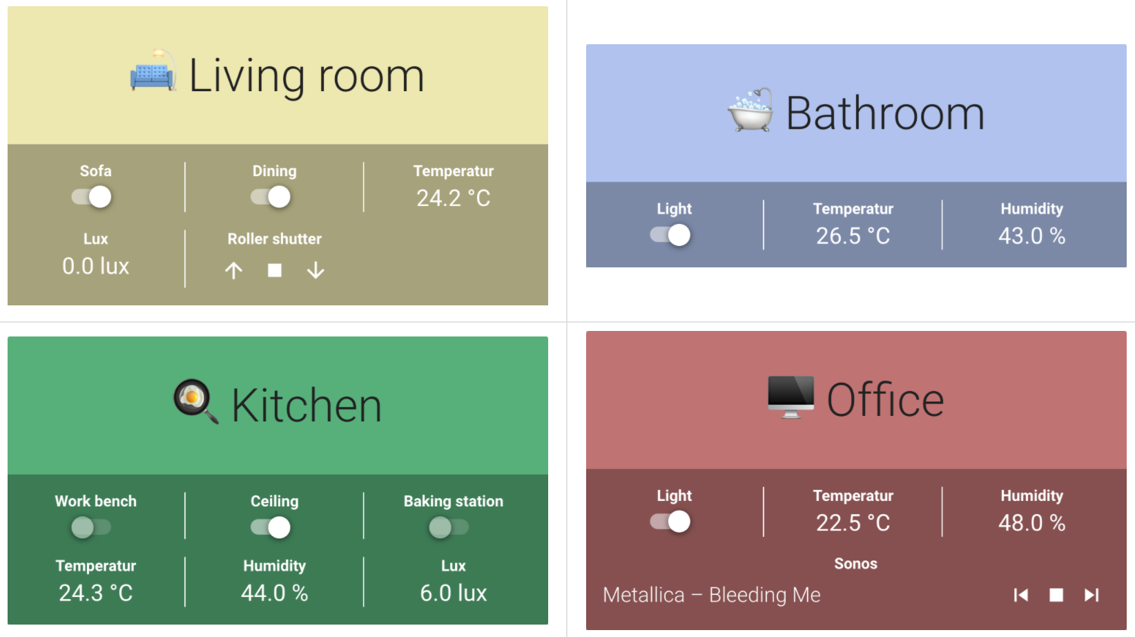
Perhaps we should make this a regular item, because this week also a new Lovelace
dashboard. This time made by JonathanGraft
Banner Card
The more you put in your dashboards, the more unclear it can become. You could, for
example thematize some cards, so that it stands out and can be found quickly and the
banner-card
Small tip: if the CSS style is not quite what you want, you can still use
card-mod
Automated Hydroponic
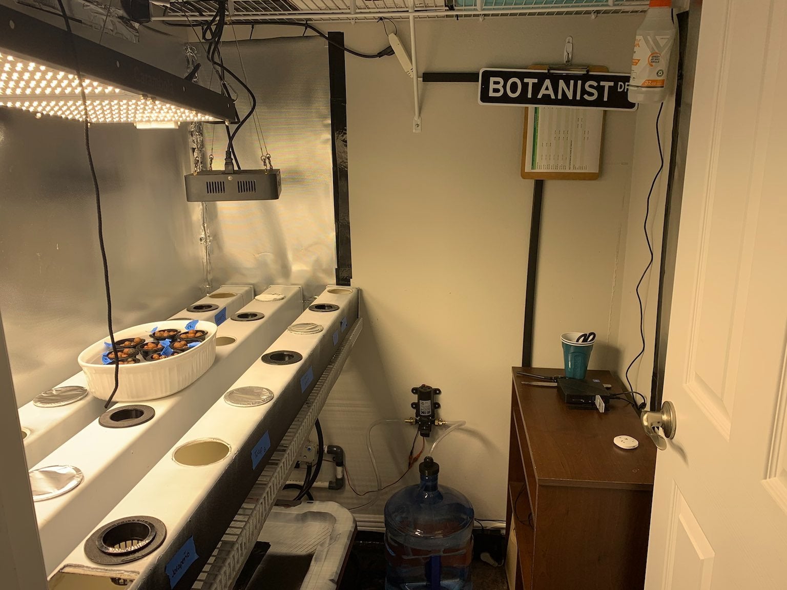
This week we also came across something very impressive, edward_snowedin
Curious how everything is worked out in detail? You will find a lot of
information here
Got a tip for the next edition?
Have you seen (or made) something awesome, interesting, unique, amazing, inspirational, unusual or funny, using Home Assistant?
Click here to send us your Community Highlight suggestion.
Also, don’t forget to share your creations with us via Social Media:
- Tweet it! Be sure to mention @home_assistant
- Share it on our Facebook group
- Post it to our subreddit
- Tag @homeassistant
on Instagram - Or via chat, drop us a line in the #lounge at Discord
See you next edition!
Community Highlights: 14th edition
The 14th edition of the Home Assistant Community Highlights! Some interesting things popped up around our community, we thought was worth sharing.
Do you want to share something for the next edition? Information on how to share.
./Klaas
Blueprint of the week
This week’s blueprint is all about climate and energy saving, SmartLiving.Rocks has written a handy blueprint that can switch your climate device based on whether a window is open or not.
Read more about it on the community forum or install this automation in your instance with a click on the my button!
ESPHome Acquisition
Last week we announced that ESPHome
Uptime Card
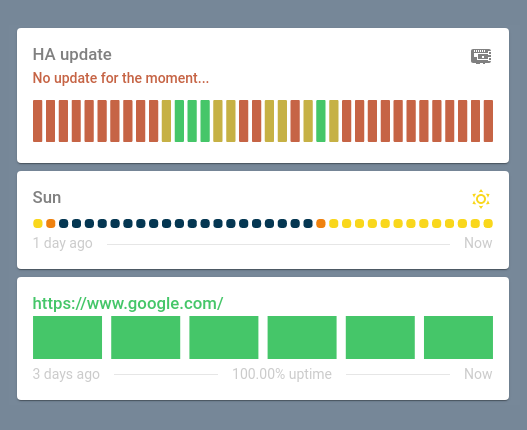
For those who would like to show their uptime robot status or other types of
binary sensors in a very special way, there is now a new card made by
dylandoamaral
Keep in mind that the card is still at an early stage of development.
DIY Smart Lock
Always wanted to make your door lock smarter? Then try the DIY solution
from bkbilly, with which
you can make your own smart door lock with a stepper motor, 3D printed gears
and ESP32, which communicates with your Home Assistant instance via ESPHome
More information about this project can be found on the community forum.
Got a tip for the next edition?
Have you seen (or made) something awesome, interesting, unique, amazing, inspirational, unusual or funny, using Home Assistant?
Click here to send us your Community Highlight suggestion.
Also, don’t forget to share your creations with us via Social Media:
- Tweet it! Be sure to mention @home_assistant
- Share it on our Facebook group
- Post it to our subreddit
- Tag @homeassistant
on Instagram - Or via chat, drop us a line in the #lounge at Discord
See you next edition!
Community Highlights: 13th edition
The 13th edition of the Home Assistant Community Highlights! Some interesting things popped up around our community, we thought was worth sharing.
Do you want to share something for the next edition? Information on how to share.
./Klaas
Blueprint of the week
It has probably happened to everyone, you forget to put the wheelie bin on the street and now you have to wait weeks again before it can be emptied again. There are already various custom integrations where you can keep track of when the pick-up days are. But maybe the Blueprint from westenberg, can also help you to get a notification every time so that you don’t forget it.
It’s a kind of magic
This week we came across another really cool project from redphx
My Aqara Magic Cube setup is a bit different (pet-proof). Details in comment.from r/homeassistant
Retro Record Player
For those who would like to build a media player in a slightly different style in Lovelave, this is really a cool project. Edwin turned it into something very special in the form of an LP record player. How cool is this!? ❤️
On this website
HomeLab monitor dashboard
Still looking for a way how you would like to set up your own system dashboard? Maybe
the photo of Akmantainman
Homelab Monitor Setupfrom r/homeassistant
Also look in the comments on Reddit, because many people shared their own version on this post already.
Got a tip for the next edition?
Have you seen (or made) something awesome, interesting, unique, amazing, inspirational, unusual or funny, using Home Assistant?
Click here to send us your Community Highlight suggestion.
Also, don’t forget to share your creations with us via Social Media:
- Tweet it! Be sure to mention @home_assistant
- Share it on our Facebook group
- Post it to our subreddit
- Tag @homeassistant
on Instagram - Or via chat, drop us a line in the #lounge at Discord
See you next edition!
Nabu Casa has acquired ESPHome
Today I’m happy to announce that ESPHome
Otto started ESPHome three years ago to make programming ESP devices as easy as possible. With ESPHome, users write simple YAML files in which you describe what components are attached to what pins of the ESP device. ESPHome will then make this available in Home Assistant. No extra work necessary. Super simple.
Example ESPHome configuration
The following ESPHome YAML example will program your ESP device. When you plug it in, it will make the light on pin 16 available in Home Assistant.
esphome:
  name: esp32_light
  platform: ESP32
  board: esp32dev

wifi:
  ssid: "MySSID"
  password: "supersecret"

api:

light:
  - platform: binary
    name: "Desk Lamp"
    output: light_output

output:
  - id: light_output
    platform: gpio
    pin: GPIO16

Otto’s vision was right and ESPHome has become the easiest way for people to integrate ESP devices in Home Assistant. For example, the tag reader is based on ESPHome, and many other projects are too.
As the project grew, so did Otto’s obligations in his personal life until they could no longer be combined. With the acquisition of ESPHome, Nabu Casa now owns the copyright of Otto’s code and the ESPHome organizations on GitHub, Docker, etc. Otto has shut down his Patreon account. Otto will step back from being part of the project management side of things. The project will continue as an open source project with the current ESPHome development team, @jesserockz
We are going to bring our experience gained from the Home Assistant project and apply it to ESPHome, like focus on community and ease of use. If you have any ideas, make sure to share them in the ESPHome discord
Update: I’ve joined the Home Assistant podcast to discuss the acquisition. Episode 83 is worth a listen.
About Nabu Casa
Nabu Casa was founded by the founders of Home Assistant. It exists to make the privacy-centered smart home accessible to everyone. Nabu Casa has no investors and is solely funded by users via Home Assistant Cloud subscriptions. With Home Assistant, Nabu Casa already works on making sure the brains of your home are the best it can be. And with ESPHome they will help you make sure that other devices are too.
Community Highlights: 12th edition
The 12th edition of the Home Assistant Community Highlights! Some interesting things popped up around our community, we thought was worth sharing.
Do you want to share something for the next edition? Information on how to share.
./Klaas
Blueprint of the week
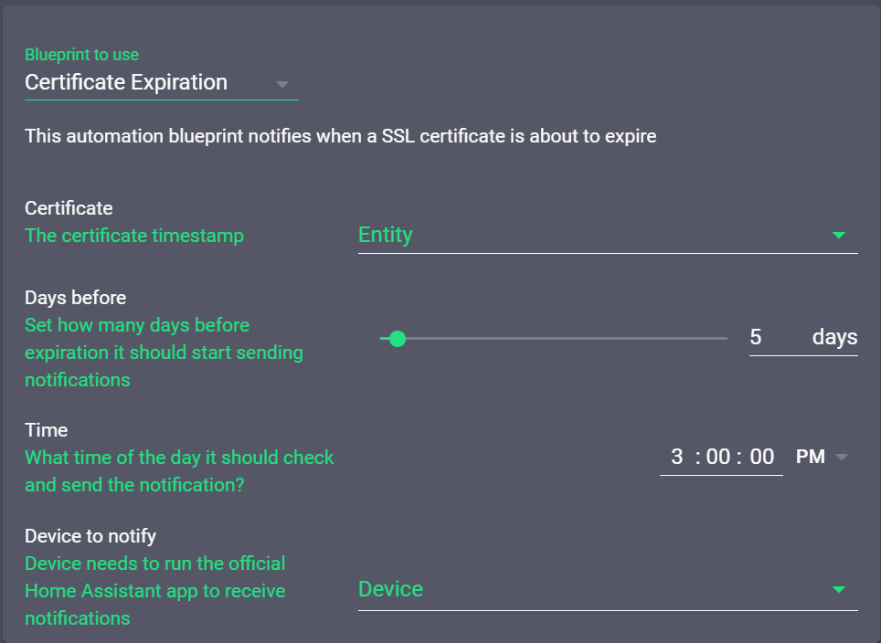
Do you have a number of domain names and would you like to track when an SSL certificate expires? Then you could try bkbilly’s blueprint that automatically sends you a notification when a sensor exceeds your set threshold value. Try it out!
Also, take a look at the Blueprint Exchange for more inspiration!
Birthday cake
Happy birthday to adlawton
My wife decided to bake me a cake to go along with my birthday present this year. Can't wait to fire this thing up!from r/homeassistant
Hopefully, the cake tasted delicious and have fun with your Blue!
ePaper display
maxmacstn
My DIY E-Paper Sensor Displayfrom r/homeassistant
Hass Workstation Service
For those who would like to read their webcam status on a Windows machine, there is
finally a solution! sleevezipper
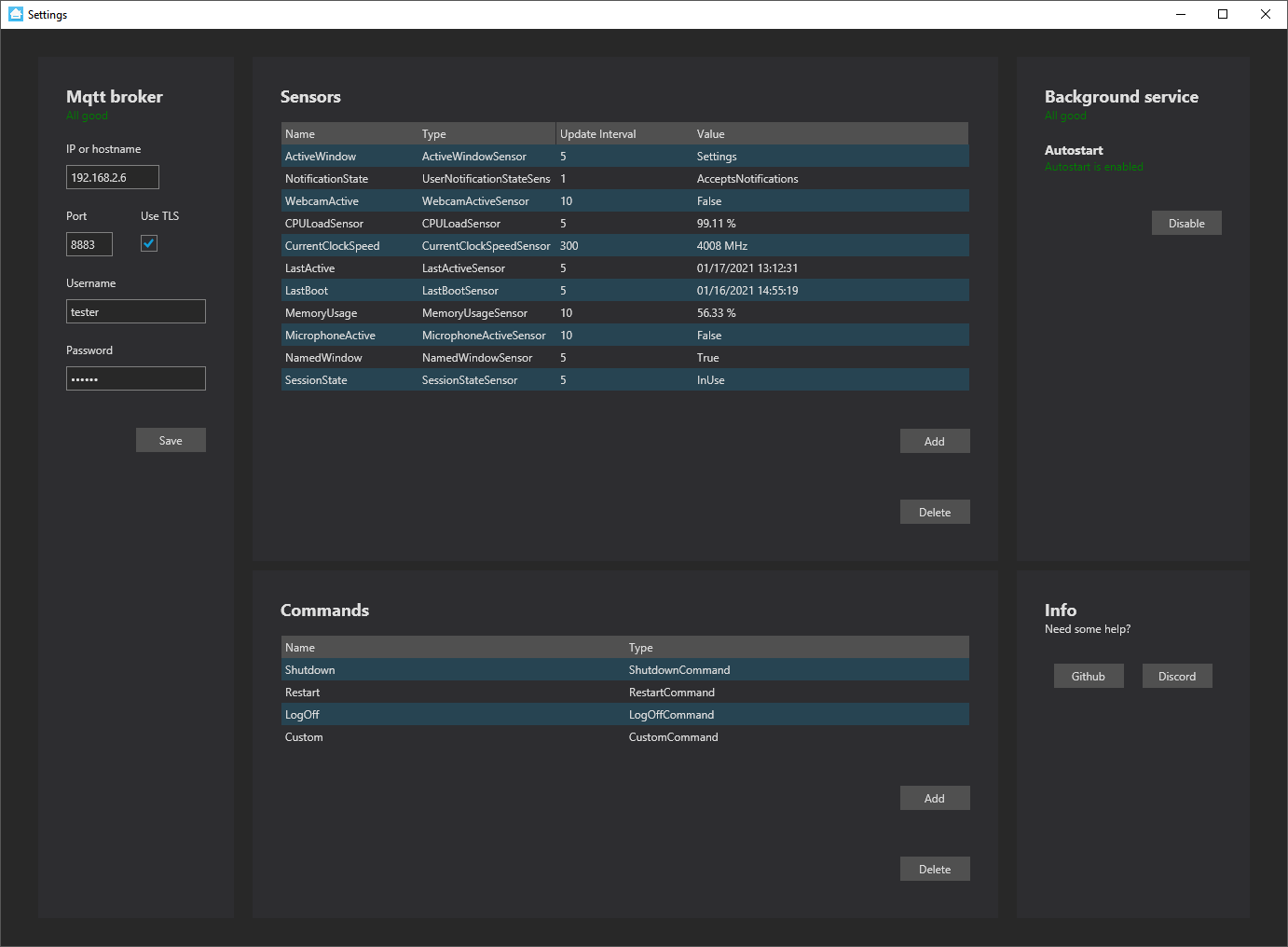
You can finally switch the lights automatically when you are in an online meeting 😉
Note: If you’re on MacOS, you can achieve the same using the Home Assistant Companion app for MacOS.
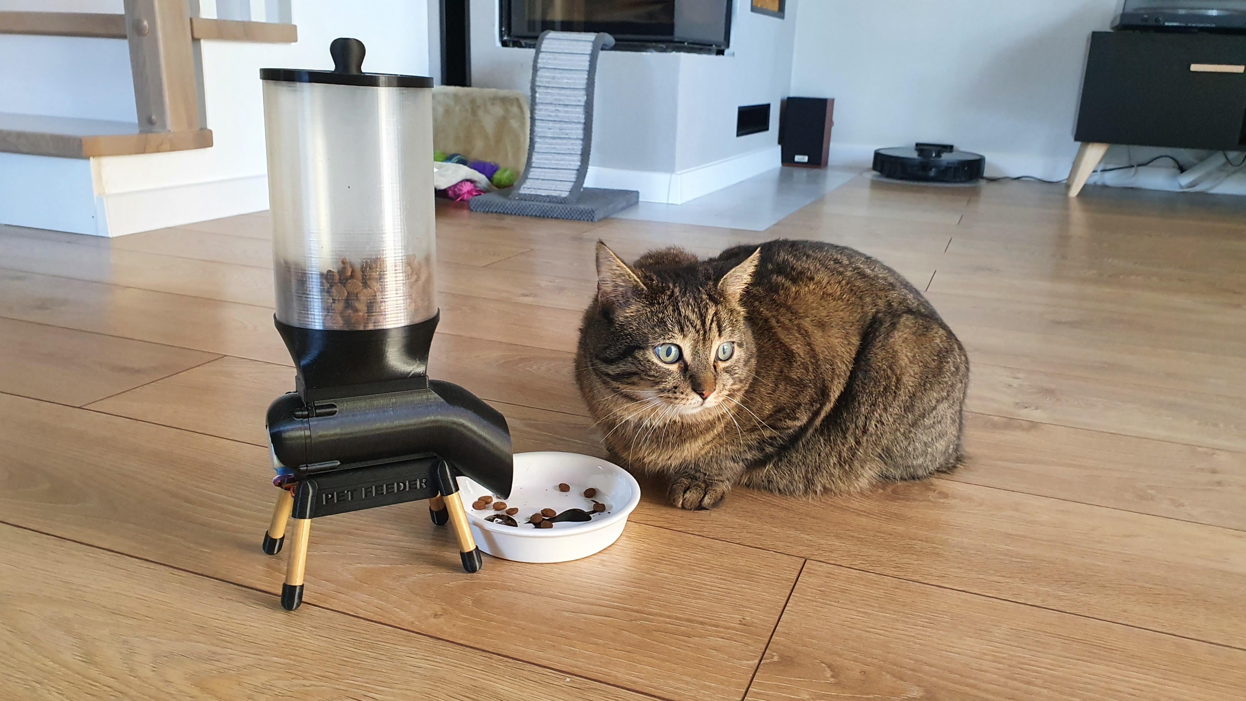
Smart pet feeder
Would you like to automate feeding your pets? Then try the project of
Sokolsok
Got a tip for the next edition?
Have you seen (or made) something awesome, interesting, unique, amazing, inspirational, unusual or funny, using Home Assistant?
Click here to send us your Community Highlight suggestion.
Also, don’t forget to share your creations with us via Social Media:
- Tweet it! Be sure to mention @home_assistant
- Share it on our Facebook group
- Post it to our subreddit
- Tag @homeassistant
on Instagram - Or via chat, drop us a line in the #lounge at Discord
See you next edition!
Community Highlights: 11th edition
The 11th edition of the Home Assistant Community Highlights! Some interesting things popped up around our community, we thought was worth sharing.
From now on we will also highlight a cool blueprint that we encountered on the Blueprint exchange. Do you want to share something for the next edition? Information on how to share.
./Klaas
Blueprint of the week
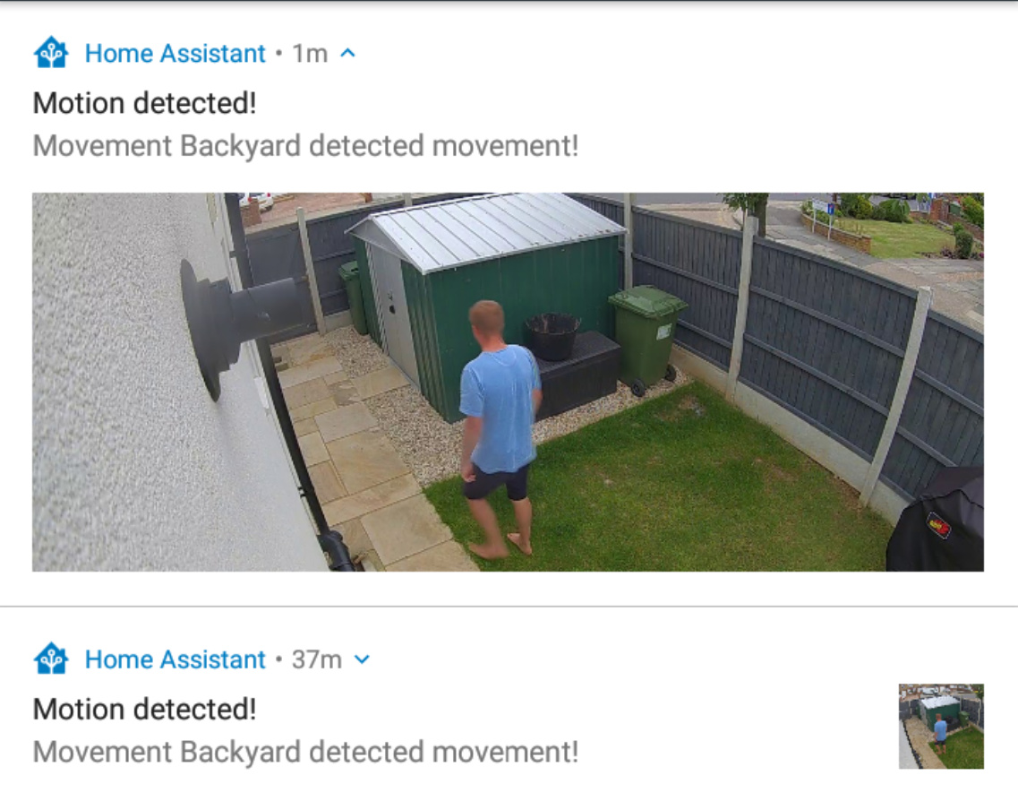
Do you have an IP camera in Home Assistant instance and do you no longer want to miss who is at the door? Then you could try the camera snapshot Blueprint from vorion. You can also indicate to which device you would like to receive a notification with a photo. Try it out!
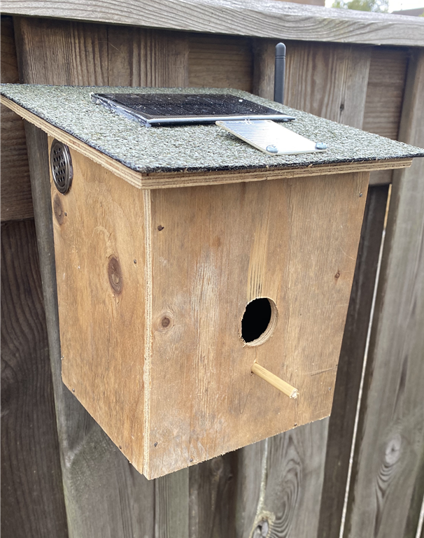
Solar weather station in birdhouse
Spring is approaching, so it’s a good time to start building a birdhouse 🐦, so why not
immediately turn it into a weather station? With the manual
Outdoor pathway light
Do you have a garden and do you want to create lighting along the paths? Maybe the
garden lighting tutorial from KidA001
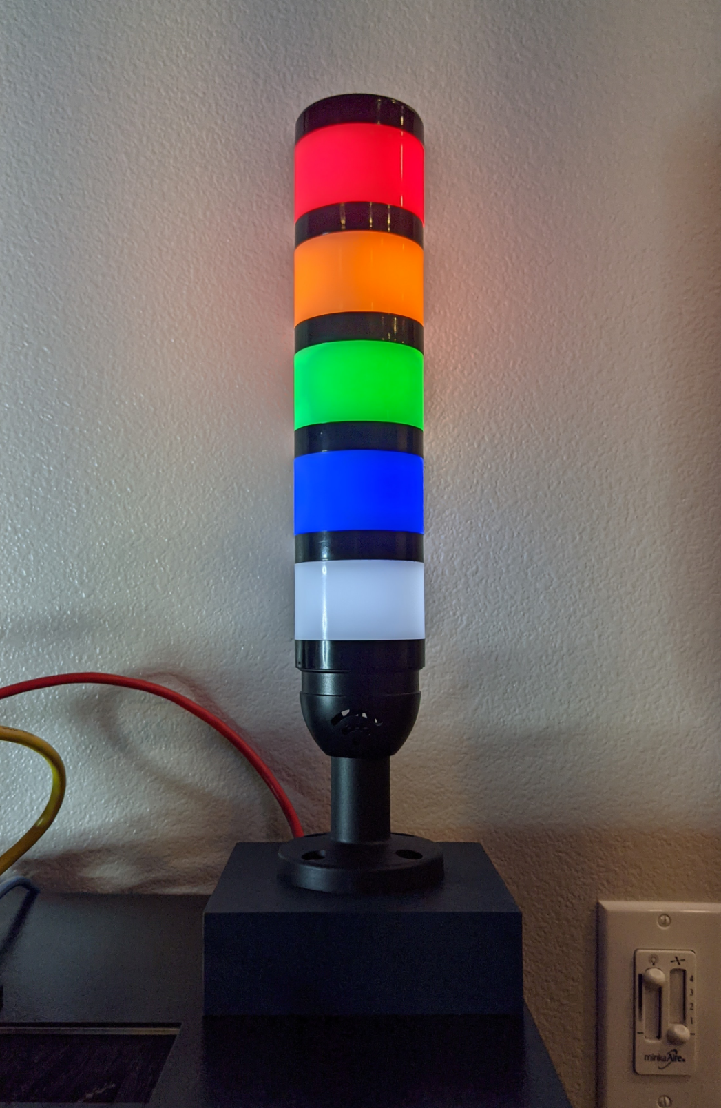
PoE powered stack light
Looking for a creative way to display the status of your Home Assistant instance? For example: there is a new Core update, too much RAM is being used or your instance is no longer online? Plenty of options to bind to each color segment.
So let yourself be inspired with the PoE stack light from Karl and start
building
Got a tip for the next edition?
Have you seen (or made) something awesome, interesting, unique, amazing, inspirational, unusual or funny, using Home Assistant?
Click here to send us your Community Highlight suggestion.
Also, don’t forget to share your creations with us via Social Media:
- Twitter it! Be sure to mention @home_assistant
- Share it on our Facebook group
- Post it to our subreddit
- Tag @homeassistant
on Instagram - Or via chat, drop us a line in the #lounge at Discord
See you next edition!
Home Assistant Companion Android App 2021 Q1 Releases
Hey everyone! It has been quite some time since we last provided an update on all that is new with the Android app. You may have already noticed that we had changed our release versioning to match that of Home Assistant Core. In fact, we will be attempting to align our releases more closely to Core releases. This way we can start supporting brand new features quickly, like the recently released My Home Assistant.
Security Check
As of Home Assistant Core 2021.1.5 some security vulnerabilities were fixed and it is very critical that all users update their instances to at least this version. The app will now do a check every 24 hours to ensure that the instance is at least on the release mentioned in the security alert. This check will be updated anytime a new security alert is issued.
Location Disabled Check
Certain app features that depend on the connected WiFi network (SSID), require the location permission to not only be granted to the app, but also have it enabled on the device. Without this, the app is unable to read the connected SSID, impacting usage of the Internal URL and any WiFi based sensors. Previously, the application would continue to function and silently fail while showing bad data for the sensors. Although the application still worked, certain parts were found to be buggy as a result of the silent failure.
Starting in android-2021.1, the app was showing a prompt before a user was able to interact with the Home Assistant frontend. We received feedback that users found this pop-up to be too intrusive. Starting android-2021.2, this pop-up has been converted to a persistent Android notification with its own notification channel. This allows the user to fully control how it is displayed on the device, including turning the channel off. The new channel name for this notification is Location disabled.
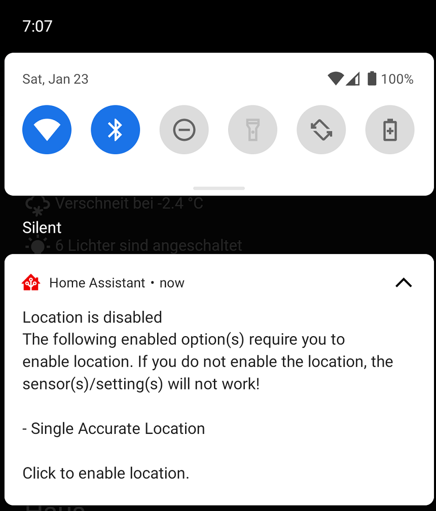 Screenshot of the location disabled notification.
High Accuracy Mode
High accuracy mode is a new feature in android-2021.2 to allow users to get much faster location updates at the cost of additional battery drain. Background location updates typically get reported every 30 seconds to a few minutes. This new feature allows the user to specify the update interval that defaults to every 5 seconds. When enabled, a persistent notification will be displayed containing some location data. This feature is an enhancement to the Background Location sensor and you can access it from the sensor settings screen. You can also control this feature via a new notification command to enable/disable it on the fly. You can learn more about this feature in the documentation.
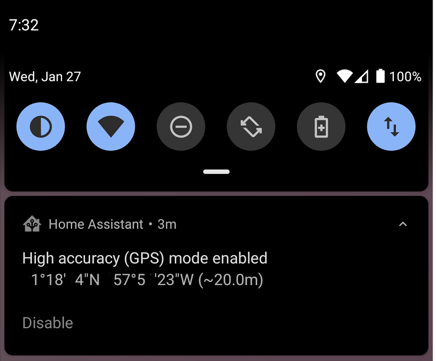 Screenshot of the high accuracy mode notification.
New Sensors
We have several new sensors to welcome to the app, all of which are disabled by default:
-
Active Notifications - The total count of active notifications visible to the user. Attributes will include all notification data.
-
App Data Sensors - Sensors to determine how much data the app has used since the last device reboot.
-
App Importance Sensor - A sensor to determine if the app is in the
foreground,backgroundor any other importance level. -
App Memory Sensor - A sensor to determine how much memory is used by the app.
-
App Usage sensors - Sensors to help users troubleshoot if the app is considered inactive and the current app standby bucket.
-
BLE Transmitter Sensor - A sensor to control whether or not the app is actively sending out a beacon to provide support for services like Room Assistant
. -
Sleep Sensors - Sensors based on a new API provided by Google for devices running the full version. These sensors can be used to determine if the user is sleeping or not. The sensors update when we get data from Google so don’t expect them to update as soon as you fall asleep.
Notification Enhancements
There have been several additions and improvements to notifications:
- Controlling Bluetooth
- Broadcast intent command has been updated to allow the user to send intent extras
- A command to launch activities, see below for more details
- A new command to launch the application to any dashboard or view without needing to click on anything
- A new actionable notification type
REPLYwhich will add a reply button to the notification and the response will be sent back in themobile_app_notification_actionevent - A command to control whether or not the BLE transmitter sensor is enabled
Intents and Activities
We have made several enhancements to further integrate Home Assistant into the Android ecosystem. First and foremost, the Last Update Trigger sensor was updated in 2021.2 to allow users to register for any intent that they want. Intentsandroid.intent_received along with the intent action and any extra data provided by the intent. Personally, I am using my Mi Band 5 with the Notify for Mi Band
A new notification command was added to allow the user to launch an activity on their android device. This command requires a new permission to be granted in order to launch activities from the background, Draw Over Other Apps. The first attempt to use this notification will take the user to the permission page so the user can grant proper access. It is important to note that if the app is not considered active then this permission page will not show up due to missing permissions. Try to test this with the app open or you can grant the permission manually in your device settings. There are lots of use cases for this feature such as being able to launch Google Maps driving mode or even setting an alarm on your device.
Unfortunately, it is not so straightforward to determine which intents and activities are supported by applications. You really need to know what to look for and there is not much in terms of documentation here from applications. Try reaching out to the developers of your favorite apps to see if they have any intents to consume. We have provided several live examples in the companion documentation. I have also started a new thread in the forums to maintain a list of all that we can find here. I will be trying to keep the first post as up to date as possible.
Other Enhancements
We have also spent time making improvements to all other areas too:
- Support for links from My Home Assistant
- Power menu fixes and enhancements including support for vacuum entities
- Haptic feedback support in the frontend
- Overriding certain URL types to launch an application or an intent from the frontend
- 3 finger swipe down gesture to trigger the Quick Bar
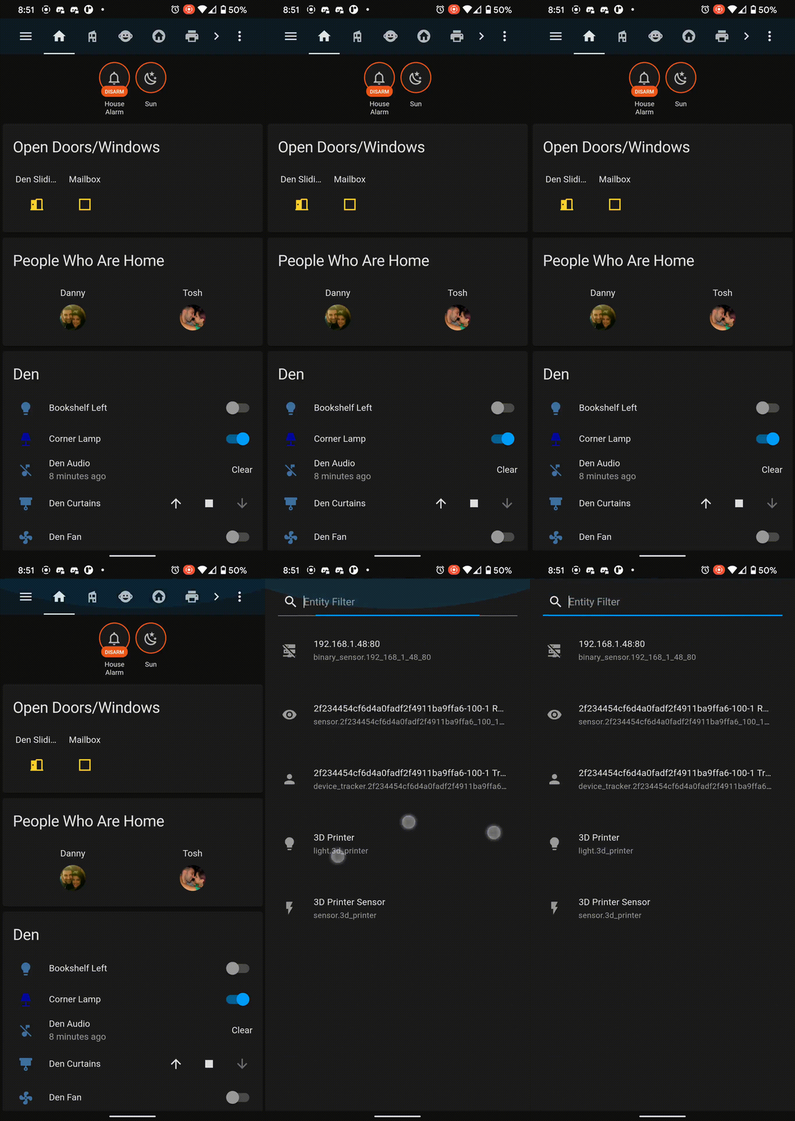 3 finger swipe gesture to trigger Quick Bar
Big thank you to everyone involved. Please keep those bug reports and feature requests coming!
Changelogs
- 2021.1.1 - https://github.com/home-assistant/android/releases/tag/2021.1.1
- 2021.1.2 - https://github.com/home-assistant/android/releases/tag/2021.1.2
- 2021.2.1 - https://github.com/home-assistant/android/releases/tag/2021.2.1
- 2021.2.2 - https://github.com/home-assistant/android/releases/tag/2021.2.2
- 2021.3.1 - https://github.com/home-assistant/android/releases/tag/2021.3.1
