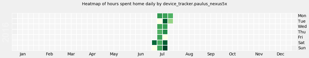
Github-style calendar heatmap of device data
Thanks to Anton Kireyeu we are able to present another awesome Jupyter notebook. I guess that you all know the graph which Github is using to visualize your commits per day over a time-line. It’s a so-called heatmap. If there are more commits, it’s getting hotter. The latest notebook is capable to do the same thing for your devices. To be more precise, for the hours your devices are home.
 Heatmap