Visualize your IoT data
The history component is tracking everything that is going on within Home Assistant. This means that you have access to all stored information about your home. Our history is not a full-fledged graphical processing and visualization component as you may know from systems and network monitoring tools. The current limitation is that you only can select a day for a visual output of your information and not a period. Also, there is no possibility to drill down on a specific entity.
This blog post will show you ways to export data for reporting, visualization, or further analysis of automation rules.
In this blog post I use the temperature of the Aare river close to where I live as a show case. The temperatures were recorded with the Swiss Hydrological Data sensor and the name of the sensor is sensor.aare.
The database is stored at <path to config dir>/.homeassistant/home-assistant_v2.db as SQLite database. In all examples we are going to use the path: /home/ha/.homeassistant/home-assistant_v2.db
If you are just curious what’s stored in your database then you can use the sqlite3 command-line tool or a graphical one like DB Browser for SQLite.
The table that is holding the states is called states. The events tables is responsible for storing the events which occurred. So, we will first check how many entries there are in the states table. sqlite3 needs to know where the databases is located. To work with your database make sure that Home Assistant is not running or create a copy of the existing database. It’s recommended to work with a copy.
$ sqlite3 /home/ha/.homeassistant/home-assistant_v2.db
SQLite version 3.11.0 2016-02-15 17:29:24
sqlite> SELECT count(*) FROM states;
24659
Let’s have a look at a sample SQL query. This query will show all states in a period for the sensor sensor.aare.
SELECT state, last_changed FROM states
  WHERE
    entity_id = 'sensor.aare'
  AND
     last_changed BETWEEN
    '2016-07-05 00:00:00.000000' AND '2016-07-07 00:00:00.000000';
The SQL statement can be formed that it fits exactly what you need. This means that you can process the data in any way you want for further use. Often it makes sense to eliminate certain entries like Unknown or peaks.
If the above query is executed in DB Browser for SQLite you would be able to save the sensor’s graph as png.
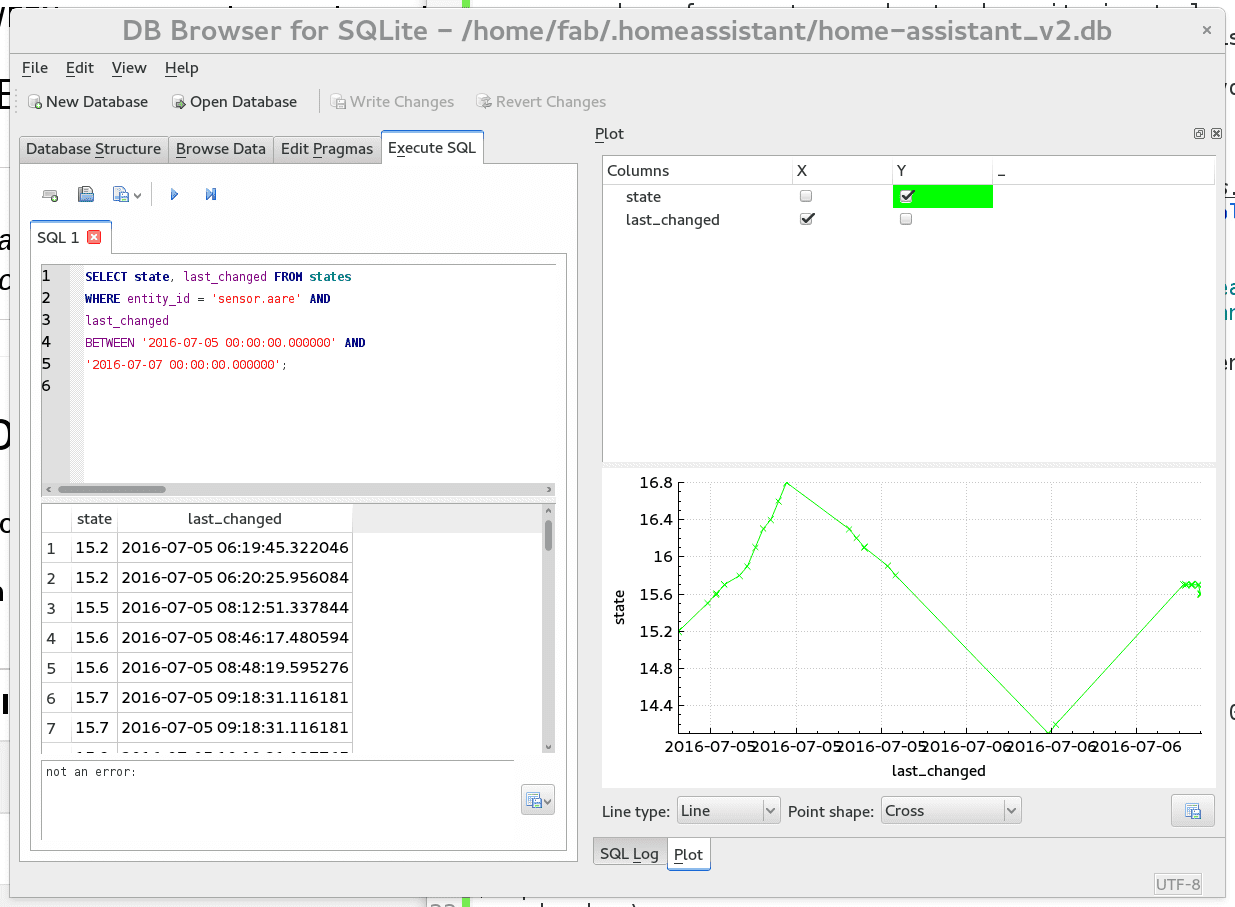 Visualization with DB Browser for SQLite
You may ask: Why not do this with LibreOffice Calc or another spreadsheet application? As most spreadsheet applications are not able to work directly with SQLite database we are going to export the data from the database to CSV.
sqlite3 -header -csv /home/ha/.homeassistant/home-assistant_v2.db "SELECT last_changed, state FROM states WHERE entity_id = 'sensor.aare' AND last_changed BETWEEN '2016-07-05 00:00:00.000000' AND '2016-07-07 00:00:00.000000';" > sensor.csv
The ordering for the SELECT was changed to get the time stamps first and then the state. Now we can import the CSV file into the application of your choice, here it’s LibreOffice Calc.
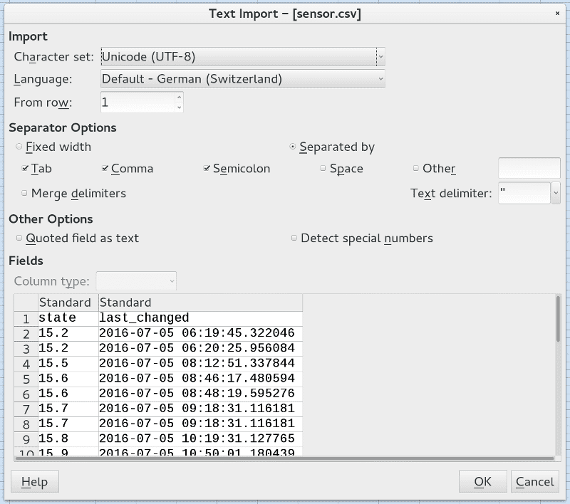 Import of the CSV file
After the import a graph can be created over the existing data.
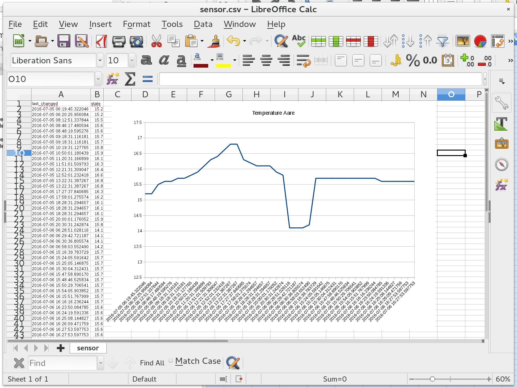 Graph in LibreOffice
You can also use matplotlib to generate graphs as an alternative to a spreadsheet application. This is a powerful Python 2D plotting library. With the built-in support for SQLite in Python it will only take a couple lines of code to visualize your data.
import sqlite3
from matplotlib import dates
import matplotlib.pyplot as plt
import homeassistant.util.dt as dt
values = []
timestamps = []
conn = sqlite3.connect('/home/ha/.homeassistant/home-assistant_v2.db')
data = conn.execute("SELECT state, last_changed FROM states WHERE "
"entity_id = 'sensor.aare' AND last_changed BETWEEN "
"'2016-07-05 00:00:00.000000' AND "
"'2016-07-07 00:00:00.000000'")
for x in data:
timestamps.append(dates.date2num(dt.parse_datetime(x[1])))
values.append(float(x[0]))
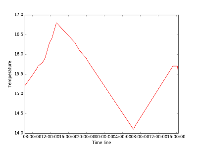
plt.plot_date(x=timestamps, y=values, fmt="r-")
plt.ylabel('Temperature')
plt.xlabel('Time line')
plt.savefig('sensor.png')
Creating a connection to the database and executing a query is similar to the ways already seen. The return values from the query are split into two lists. The time stamps must be converted in an value which is accepted by matplotlib and then the graph is generated and saved as image.
Sensor graph generated by matplotlib
Most of the graphs are pretty ugly. So, further beautification will be needed. If you have created a nice report including some amazing graphs then the Home Assistant community would be grateful for sharing them in our forum.