Dashboard chapter 2: Let’s redesign the cards together!
 Madelena Mak
We have been steadily shipping updates to our new dashboard design every month since we announced Project Grace, and our new grid system is finally maturing to a point where we would like our community of contributors to get involved!
If you are a UX/UI designer or a custom card developer who would like to contribute to the Home Assistant project, sign up to be part of our dashboard working group and read more about what you can do to improve compatibility of your custom cards.
What’s new since the last chapter?
Thanks to your feedback, we continued to build upon the grid system and the sections layout with features such as:
- Max column option for sections (2024.4)
- Drag and drop for card features (2024.5)
- Visibility options for sections and cards (2024.6)
- Dashboard background (2024.6)
- Resizable cards on sections view (2024.7)
Check out the corresponding blogs for more details.
New badges!
In the upcoming 2024.8, we are introducing our redesigned badges.
The original badges was created as far back as version 0.7 in August 2015, and its design has not changed much since. Designed to sit at the top of a dashboard view, badges provide a summary of the most important information that you need to know, at a glance.
According to our case studies of dashboards created by our users, we found that these badges are underused, mainly due to its outmoded appearance, bulky size, and the lack of configurable options from the UI. Instead, we found that many users are using Mushroom Chip cards
The new badges feature a wide range of configurable options from the UI. For each individual badge, you can now specify whether the icon, name, and/or state will be visible, and you can configure the contents within each of these components: States can include multiple attributes to be displayed, and icons can be replaced with the entity picture for a person’s avatar or a media_player’s record cover.
Visibility options are also available for the new badges, which allow you to show or hide them based on who is viewing the dashboard, what screen size it is displayed within, whether an entity is in a certain state, and more.
Badges can be easily reordered with drag-and-drop, and they also come with copy, paste, and duplicate features that cards in the new sections view have. Last but not least, the new badges work across both the new sections view and the old masonry view.
Notes for card developers
On a default installation, we offer one built-in badge, the entity badge. However, you are not limited to that, as you can build and use your own! Defining a badge is done in a very similar way to defining a custom card. For more information, check out our developer documentations.
We would love to see your new creations - perhaps a small sparkline graph, or how about a mini progress bar? What do users want to quickly find out on a dashboard at a glance, and what can you display in this small amount of space to get the message across? Let your creativity go wild!
What’s next for Dashboards?
As the new sections view matures in its featureset, we want to begin our focus on a bigger task: to revamp all the dashboard cards and bring them up to modern standards. To achieve this, we need you - the power of our contributor community!
How can we achieve this?
Once upon a time (I mean, Summer of 2018), a group of developers came together to create the Lovelace dashboard. It was built organically - developers contributed where they see a need, either for replicating a feature from the previous States UI, or for adding something that they use personally. While the cards that come with Lovelace are adequate, the usability and aesthetics left much to be improved. In order to raise the bar in our design standards, we need more design-minded contributors.
Enter (semi) open-source design.
Traditionally, open-source projects are built around code repositories such as GitHub. This allows easy submission of contributions by anyone who can code. We figured that we may be able to achieve the same for product direction and UX design, too.
However, it is not easy to start with a blank canvas, and designers and developers have different workflows. Therefore, as the maintainers of the Home Assistant project, we are providing the product goals, the base design framework, and the process to facilitate collaboration.
Product goals: What do we want to achieve?
The goal of Project Grace is to make customization and organization of dashboards easy and intuitive for all users in a household. Dashboards are created to help users monitor and control smart homes, and as cards are the building blocks of dashboards, by extension, cards should also achieve the same product goals:
- Monitor: Allow users to monitor the states of the device and service entities, with data visualizations that are easy and quick to understand.
- Control: Allow users to control the devices in their smart homes, mainly with touch screens, and on the desktop with a mouse occasionally.
To bring them up to modern standards, we want you to join us to:
- Revamp existing cards to fit the new grid system. This will achieve the modularity and ease of customization we are looking to achieve with the sections view.
- Standardize the design system. The new cards should adhere to the same design tokens for typography, iconography, shapes, dimensions, and more.
- Create new cards. This will fill the current feature gaps that we have not addressed.
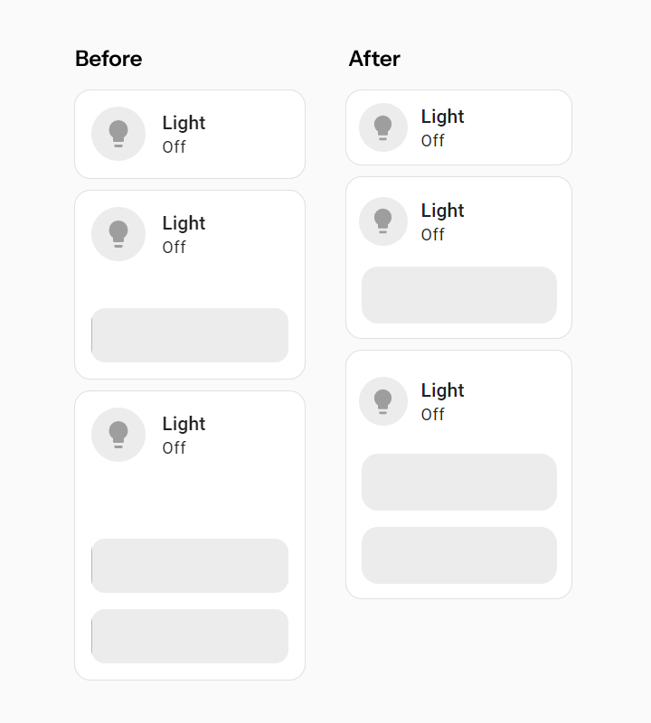
- Extend existing cards with card features. Card features allow every card to be more modular and be always up-to-date.
- Incorporate existing popular cards on HACS. This will reduce the need to install custom cards and also bring them up to the UX standards of the Home Assistant frontend.
Design framework: What will our card designs be based upon?
The grid system
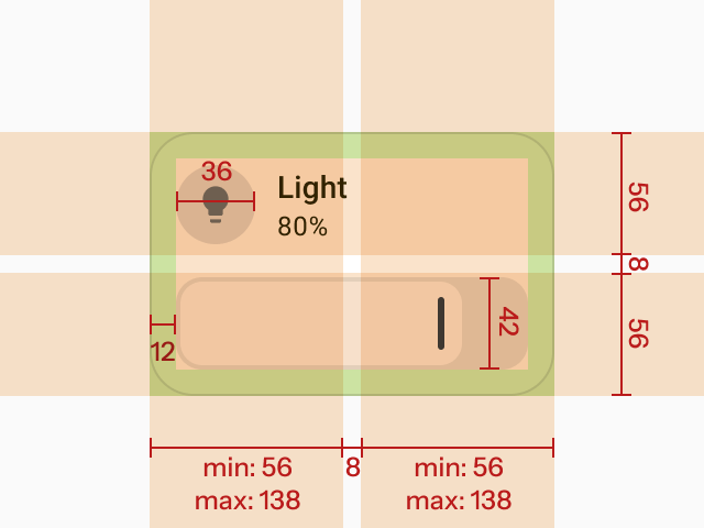
The new cards will be based on the design grid system as defined previously, finalized with a few tweaks for better information density and aesthetics. We have reduced the height of each row on the grid to eliminate the empty space between the card contents and card features:
The finalized grid dimensions are as follows:
- Row height: 66px → 56px
- Gutter: 8px
- Icon size: 40px → 36px
- Feature height : 40px → 42px
Design guidelines
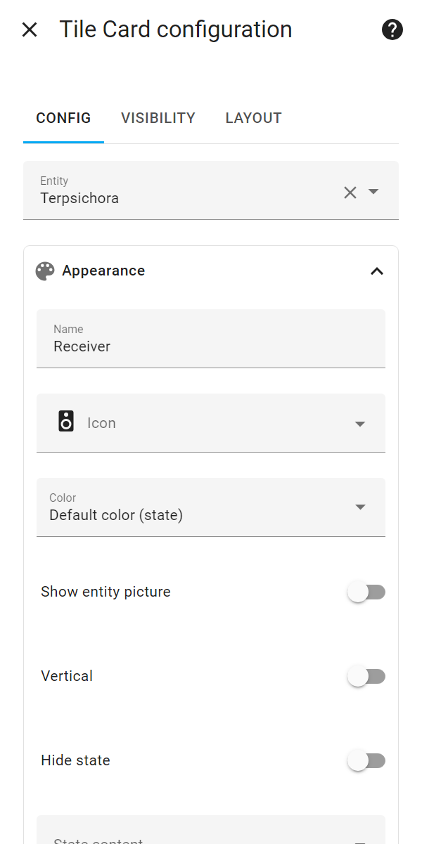
We have also researched on the design of the Tile card, and here are some of the guidelines we have deduced from the research:
- Each card used for controls should have a clear primary action.
- Affordance: Everything that is designed to invite users to interact with should look clickable.
- Features get better results than icon buttons.
- Don’t clutter up the card.
As for the rest of the design system, we have been gradually moving towards Material 3 for the past year, but we have yet to finalize and adapt it fully on our frontend. We would like to hear your input on how we can bring it to our cards.
Process: How can we work together?
Since open-source design is not attempted often, there are not a lot of precedents we can refer to. We are experimenting with our process and will tweak it as we learn more. For now, we come up with the following process:
- Working group, assemble! If you are an UX designer, product person, or a frontend developer, you are welcomed to sign up to be part of the dashboard working group! We pick based on experience in dashboard and card design and development.
- Meet and greet. We will organize introduction workshops where everyone comes together to learn about what we can offer and define our project goals.
- Start small. We will parcel out each individual card as a project. We will start with the easier cards first. Every working group member can work on as many cards as they like.
- Research and design. We will quickly research, ideate, prototype, and validate our designs together, and share our designs and work-in-progress live on Figma.
- Let’s build it! We will clean up and finalize our designs, develop the cards, and launch the new cards with the next HA release!
Action items: What can you do as a custom card developer now?
If you have already created some custom cards, this is a great time to start upgrading your work to the next level!
1. Fit your custom card into grid system
In order for your custom card to work well with the sections view, you need to specify the default, minimum, and maximum width and height of your card:
- Default width and height is the size of the card when it is first added to the dashboard.
- Minimum width and height is the size of the card when its content cannot shrink further in size to adapt to and be usable with the provided area.
- Maximum width and height is the size of the card when its content cannot expand further in size to adapt to and be usable with the provided area.
Our grid system has a fixed row height, which means that you can estimate how many rows your card will need by dividing the height of your card by the sum of the row height and the gutter.
For more information on how you can implement the card resizing logic, check out our developer documentation.
2. Follow usability guidelines from our user research
Audit the usability of your custom card with the guidelines as mentioned above.
3. Create new card features
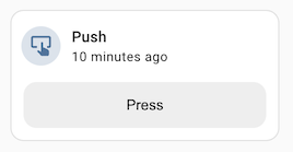
Card features are widgets that can be placed inside cards for displaying or controlling an attribute of the entity. By building custom card features, you can expand the abilities of many cards that support card features. You can also allow your custom card to use card features, similar to what we had done to the [Thermostat card].
4. Ensure features are editable in UI
The inclusion of a visual editor is key to the ease of use of your custom cards, allowing more people to be able to edit and use them on their dashboards. Be sure to include only the necessary options in the visual editor, while also hide away the less used options in YAML or in an accordion UI to avoid clutter.
That’s all from us this time! To learn more about the UX research and design thinking behind the dashboard, be sure to check out our Dashboard Chapter 2 live stream